When creating any type of marketing strategy or tactic, you should always have an endgame in mind. The goal of any marketing material is to get your prospects or customers to take some type of action.
Whether you’d like prospects to download your e-book so you can capture their email address, sign up for your course, go straight to buying your products, or take a different action, it isn’t easy to get them there without a strong call to action, or CTA. In this article, we’ll discuss what CTAs are, how to develop them and how other brands make CTAs work for them.
What is a call to action?
A call to action is a set of words or a phrase that pushes people to take action. A poorly crafted and executed CTA can result in subpar marketing performance, while a good CTA could make a positive difference in your company’s bottom line.
CTAs are often clickable, embedded elements in an ad or email or on a website. They are generally aesthetically distinct from other text and encourage users to engage by clicking through to a landing page, downloading a file or making a purchase.
Marketing copy that does not have a CTA can leave prospects feeling unsure of what to do. In the worst case, it results in them doing nothing, moving on, and forgetting all about what you offered.
A call to action is a word or phrase that encourages prospects to take an action. In digital marketing, CTAs are generally clickable or interactive.
Benefits of good calls to action
Obviously, good CTAs get consumers to act, but these are some more specific benefits:
- Building up your audience (by collecting social media followers or subscribers to your email newsletter, for example)
- Adding purpose to your marketing
- Giving consumers clarity on what you want them to do after they’ve digested your content
- Helping push prospects along through the buyer journey process
- Increasing your leads and sales
If you don’t include a CTA in your marketing campaigns, you could be missing out on the above key benefits. You could be wasting your time creating marketing materials in the first place.
How to develop a strong call to action
Follow these best practices when creating your CTAs.
1. Put yourself in the shoes of your target customers.
If you were your target customer, what would inspire you to take action? If you can’t answer that, put a plan together to learn about your audience. Ask yourself these questions:
- What motivates your audience to buy your products and services?
- How do their minds work?
- What kind of offers do they prefer — such as “buy one, get one free,” or a percentage off the final price, or free shipping?
- Are people so passionate about your brand that you don’t need to entice them with an offer and can instead get them to act by asking them in a fun and engaging way?
- What problems does your audience have that you could solve for them?
- Can these problems be solved with an educational e-book, a free webinar or another type of giveaway?
Understanding the way your customers think and buy can help you create CTAs that speak to them, or maybe even tug at their heartstrings to get results.
2. Experiment with length.
What’s better — a shorter or longer CTA? Like other factors, this depends on your audience. As a rule of thumb, don’t use unnecessary words; get straight to the point (unless you’re strategically adding humor to your CTA). In general, CTAs shouldn’t exceed 15 words; if they’re any longer, your prospects may lose interest and not follow them. However, if you’re torn on what to say, experiment with CTAs of slightly different wording and length to see what gets through to your audience.
CTAs can improve your
marketing ROI significantly by increasing the number of leads in your sales funnel and nurturing existing leads with new, compelling content.
3. Cater CTAs to where prospects are in the buyer journey process.
If your company has products and services that lend themselves to a long sales cycle, a CTA that prompts prospects to take action right away on their first touchpoint is unlikely to be effective. For products that are typically cheaper and require less planning to buy, though, you can often score the sale with a simple “buy now” CTA. Here are two examples:
Long sales funnel in the business coaching industry
Prospect Sally learns about you through your Facebook ad, which targeted people who have expressed interest in business coaching on the topic of managing staff. Your Facebook ad has a compelling photo and links to an article that promises to solve a common problem: learning how to be a good manager. The text in the ad offers a snippet from the article, compelling prospects to click the CTA button to find out what they can do to be a good manager.
Sally reads your article and is impressed by your content. She learns something new but has never heard of your brand before, so asking her to spend $1,000 for five coaching sessions is a big stretch. Instead, you conclude the article with a CTA to watch a free video that solves more of her problems. To access the video, she must provide you with her contact information.
Sally wants that information, so she gives you her name, email and phone number. In the video, she sees your face. She learns something about you and better connects with you. At the end of the video, you make your call to action more of a direct ask: “Sign up for my coaching program today and get one free session.”
Sally is now more likely to buy from you. Even if she doesn’t make the purchase, you have her email address, so you can send her drip campaigns with more great content and calls to action.
Short sales funnel in the skin care industry
If you sell products that lend themselves to consumers making impulse buys or overall cheaper purchases, such as skin care products, the CTA on your Facebook ad may only need to say, “Clear acne fast!” and link to a product page to get prospects to buy.
4. Experiment with different CTA writing styles.
Testing different CTA copy is key to getting the best results. Try these types of copy:
- Words that evoke emotion: “Make a $5 donation to help provide meals to hungry children.”
- Questions: “How can this be only 99 cents? Learn more.”
- Time-sensitive offers: “Buy one, get one free — today only!”
- Humor: Dancing figure pointing to a swipe-up button
- Solution to a problem: “Stop being confused about why she didn’t call you back. Get the answers.”
- Personalization (in a drip email campaign): “What are you waiting for, Sally? Claim your free session.”
Take note:
- Your copy shouldn’t be overly complicated.
- If the CTA doesn’t work, don’t worry. Try again with different tactics until you strike gold.
- Your text should demonstrate value to the reader.
5. Make it look like a CTA.
A call to action can’t look like all the other text or images on your website; it needs to distinguish itself as a CTA. Consider a button design (as shown in the examples below), bold font or text within an image. When creating CTAs for social media posts, you could use emojis that point prospects to links. The bottom line is that you want to draw attention to your CTAs.
Figure out how your audience buys so that you can create CTAs that cater to their needs, concerns and place in the sales process. CTAs should be noticeable, clear, and punchy to encourage quick action.
Best CTA examples to learn from
To give you a better idea of how to write CTAs, here are several examples of what’s working for other businesses.
Foot Cardigan
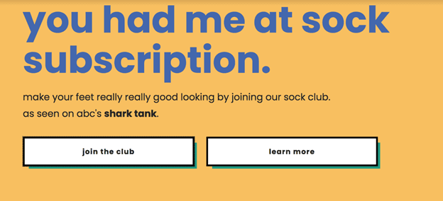
“For a while, we were using ‘subscribe now’ instead of ‘join the club.’ However, once we changed the CTA, the [click-through rate] doubled,” said Daniel Seeff, CEO of Foot Cardigan, a sock subscription company. “I believe that ‘join the club’ is more persuasive, as it uses unique wording and suggests some exclusivity.”
This CTA, he also explained, is a kind of social proof, as it hints that there is a “club” of other customers already enjoying the product.
“‘Join the club’ works better because users don’t get the feeling that they need to pay for something immediately,” explained Seeff.

Source: Foot Cardigan
Scalefluence
The team at Scalefluence found that keeping its company website CTAs short, to the point and at the top of its pages works best. This is a tactic that founder and CEO Tony Newton always advises other businesses to follow.
“Most people don’t have time or [won’t] take the time to scroll to the bottom of your website. With that being said, you may need to have one or two CTAs if you have two different types of audiences and position them at the top of your website.”
Newton offered this example from the Scalefluence homepage:

Source: Scalefluence
“This example from our website follows that strategy. Our CTAs speak to our influencers, with a little play from a well-known milk campaign of several decades now (‘got influence?’), and potential clients (‘need influence’), emphasizing ‘need’ first and foremost for marketers in the influencer space.”
Next up, he offered a CTA example from a bit further into his company’s subpages that adds context to the concerns of influencers who want to make sure they don’t compromise their audience by joining Scalefluence’s marketplace.
“Influencers are still in control of their creative process. Plus, we add a little bit of fun.”

Source: Scalefluence
Finally, because he believes that agencies and brands are more serious, Newton then focuses on an ROI CTA.
“Their concerns are spending money and not getting anything, which we also address, but now without any color or humor,” he added.

Source: Scalefluence
These three examples offer direction on how to integrate different CTAs for different parts of the sales process throughout your website.
Store Space Self Storage
As a marketer, you want your prospects to take action right away. A CTA with the word “now” in it encourages that. In the case of Store Space Self Storage, that word makes perfect sense and would be a natural action for prospects looking for a space near them.

Source: Store Space Self Storage
“Our CTA on StoreSpace.com is as simple as we can make it, and it works for us,” said Greg Birch, SEO manager for Store Space Self Storage. “It tells customers what they can expect to do by using this CTA: ‘Find storage now.’ This is what people come to our site to do, so we try to present it with as few frills as possible to make it happen quickly.”
A key point of this CTA, as Birch pointed out, is the flexibility for prospects to enter a street address, city or ZIP code.
“This way, it decreases the chance that they’ll have to search again, which would increase their chance of exiting our site and going to a competitor,” he added.
Delta Sonic
Calling prospects instead of emailing them can help you close a sale, but getting prospects to share their phone numbers can be a difficult task.
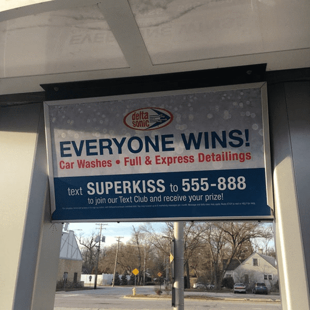
Meghan Tocci, a former content marketer with SimpleTexting, a text message marketing company that represents Delta Sonic Car Wash, found a way to incentivize prospects to offer up their phone number. [See our SimpleTexting review] She noted that this single CTA earned more than 50,000 text subscribers across all 29 car wash locations:

Source: Delta Sonic
“Their CTA was a simple appeal: ‘Send us a text and we’ll reward you,’” Tocci said. “However, by adding the element of surprise by advertising a ‘prize’ versus a full description of what they would receive, the intrigue drove thousands of people to opt in to their marketing channel.”
Courtney Elmer
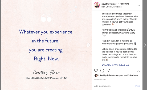
Sometimes you’ll need to create CTAs that push prospects through a sales funnel, as business coach Courtney Elmer, founder and CEO of The EffortLESS Life, did. She directed prospects to listen to her podcast episode in this Instagram post’s CTA:

Source: Courtney Elmer
Podcasters and entrepreneurs can pull tips or quotes from their podcasts, post them on Instagram, and prompt followers to listen to that specific episode to increase podcast downloads. This CTA helped Elmer increase engagement and prompted her followers to download and listen to her podcast, as noted by her marketing team. Then, if listeners like what they hear, they might sign up for one of Elmer’s services, such as a retreat or online coaching.
Bad examples of calls to action
Avoid these common mistakes for the best possible calls to action.
The “learn more” button
A button directing readers to “learn more” or “get started” at the bottom of a page isn’t an inherently bad CTA, but it can feel generic. Calls to action should indicate clear steps to take so you can convert prospects into customers. With something as simple as a “learn more” or “start here” button, you might not incite a strong emotional response — or any action.
Single-word CTAs
A one-word call to action typically inspires a weak emotional response from the viewer. Ending an advertisement with “buy,” “join” or “subscribe” can read as cold and forceful, whereas a longer CTA gradually guides prospects to take action.
Additionally, single-word CTAs are often too vague. Even if they’re clear action words, a prospect could have trouble interpreting them, causing you to miss out on valuable conversion opportunities.
Guilt-tripping
Offering a reward is a great way to get new customers, but guilt-tripping customers for turning it down won’t convince them to change their minds. If anything, this sort of last-ditch attempt can come off as annoying or offensive. That could cost you customers in the long run.
Develop a stellar call to action
A good call to action isn’t just a witty way to end advertisements — it can entice potential customers to continue down your sales funnel. The better your CTA, the more long-time customers you stand to gain, so don’t let a bad one hold you back. Use the tips above to develop CTAs that can help your business really stand out.
Additional reporting by Isaiah Atkins and Max Freedman.

